
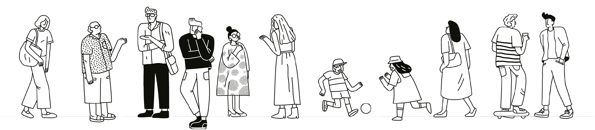
Brand Identity
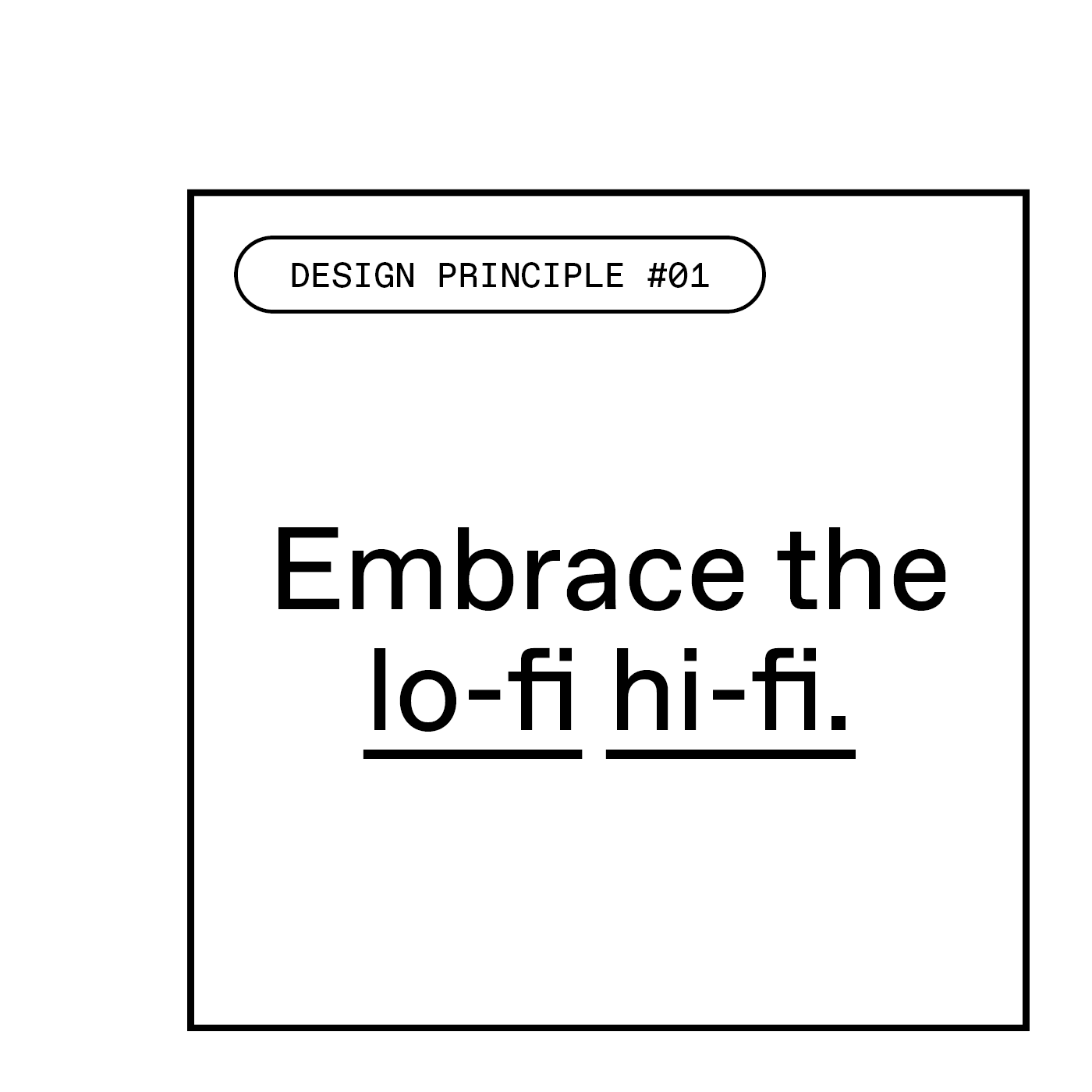
Our brand identity allows us to tell engaging stories to our different audiences. It's how we look and act. The simplest way to describe it is a dialectic between lo-fi and hi-fi, or today and tomorrow. It intertwines the final built outcome with our process and culture.
It demonstrates our ability to get things done, while also celebrating our inquisitive side; the side that's constantly innovating and always aspiring for a better future.
Guidelines
This website is a tool for BVN'ers that simplifies access to our templates and introduces our brand identity. The success of our identity relies on all of us embracing its implementation.
In upholding the guidelines, we will ensure a strong, consistent, and cohesive brand identity for BVN. Download our guideline documents to get a fuller understanding of how all the elements of the brand come together.
Strategic Marketing Plan 2024
Our 2024 Strategic Marketing & Communications Plan has been informed by our brand strategy and an extensive internal consultation process. Each year we define our objectives, and chart a path to achieving them.
Whether we like it or not, "our story" is already being told. Having a plan means ensuring authorship, agency and influence. Planning does not replace agility however! It aligns and empowers each of us and our external partners for the year ahead.
Our plan seeks to showcase our values, capabilities, and expertise to key target markets, while simulataneously building reputation and trust, inspiring and influencing, and creating meaningful impact.
Logo
The logotype draws inspiration from its predecessor. Taking a previously closed box and opening it up to future possibilities; letting light in, celebrating the collaborative and iterative nature of our practice. The dashed line visible in our logotype becomes a foundational motif used throughout our brand identity system.


Templates
The BVN Brand Identity relies primarily on three presentation templates: InDesign print and digital and PowerPoint. These templates will be periodically improved with your feedback, so you can always rely on the latest versions being downloadable below.


Components
Information visualisation is about a sum of parts; bringing together colour, icons, illustration, shape, line, type talkers and cards, texture and our secondary typeface. These components can be composed in a
myriad of different ways, bringing vitality and visual impact.
Typography
Our primary typeface is a key signature of the new brand identity. It's called Favorit and we have 5 cuts as our primary typeface. The Bold and Lining are used for headings or emphasising key words or sentences. Regular is used for body copy. Our secondary typeface is Favorit Mono which is used for secondary information and in diagrams / info visualisation.
We have four key principles:
#1 CONSIDER YOUR AUDIENCE
#2 PRIORITISE ACCESSIBILITY
#3 USE RESTRAINT
#4 BE VIBRANT AND IMPACTFUL

Colours
Our primary colour palette is a strong identifier for BVN and should always be utilised first.
Our secondary palette extends the primary palette and can be considered for more detailed pieces of communication.
It is only to be used in plans, info graphics, or complex design communication.
Three ways to think of colour:
BACKGROUND, HIGHLIGHT, DIFFERENTIATE.

Black
White
Grey
Light Blue
Purple
Light Green
Light Orange
Red
Dark Blue
Medium Green
Orange
Light Yellow
Blue
Sea Green
Yellow
Training
As part of the BVN Brand Festival, an extensive tutorial series has been developed to support you in getting the most out of all your new assets.
Feel free to download the full tutorial presentations, recordings, and associated files at the below links:
Details, new learning platforms and video's incoming! Watch this space!

Copyright
All rights reserved to BVN Architecture Pty Ltd
ABN 46 010 724 339
ACN 010 724 339